Coronablog by Geert Van Herck: Market Observations

Geert Van Herck
Chief Strategist KEYPRIVATE
July 14, 2020
(updated April 15, 2024)
4 minutes to read
The US merchant bank JPMorgan recently published its quarterly Guide To The Markets. This research is freely available (accessible via Google) and contains a wealth of information about global economic trends. It also takes a look at all developments in the financial markets. From this information, we have selected the following three graphs, which are of major interest to investors.
1. Future returns on US shares are on the low side.
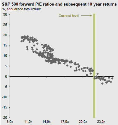
Graph 1 shows the relationship between the current valuations of US shares and their expected 10-year returns. Many studies have shown that the value paid today for shares (using popular valuation ratios such as the price/earnings or price/book value ratios) has a major impact on long-term returns (5 to 10 years). The graph shows the value on the X-axis, based on the p/e ratio (using projected earnings per share for the next 12 months) and the average annual return on US equities. The graph is clear: the cheaper (more expensive) they are, the higher (lower) the average returns on an investment in US shares.
Based on the current valuations (about 22 times the expected earnings in 2021), an average return of around 0%–5% can be expected for the next 10 years. This is well below what the US market has delivered in recent years (over 8%). It is an important warning for those who want to invest internationally in the next few years: if they wish to achieve returns from equities, they need to give precedence to regions other than the US in their portfolio.
Graph 1: Relationship between valuations and future US returns

Source: JPMorgan Guide To The Markets
2. Will stock markets in emerging countries start to rally?
We discussed the poor outlook for US equities above. Where can investors go for a return? One opportunity right now can be found in the stock markets of emerging countries such as China, Brazil and India. Valuations there are on the low side, but in economic terms these countries are already making up ground.
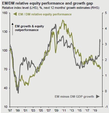
The graph shows how the grey curve has been rising sharply in recent months. This curve measures the difference in economic growth between emerging countries and Western industrialised countries. This difference in growth is closely correlated with the stock market performance of emerging countries compared to the Western markets. The graph illustrates that if emerging countries perform more strongly (weakly) in economic terms, their stock markets perform better (worse) than Western markets.
The past few years have clearly favoured the West, but we appear to be reaching a turning point. The growth advantage for some, including the Chinese economy, could be the precursor for recovery in the stock markets in these emerging countries. The green curve (which measures the relative stock market performance of both regions) has not yet moved upwards. Interested investors may wish to increase their positions in emerging markets in the coming months.
Graph 2: Emerging markets vs. developed markets

Source: JPMorgan Guide to The Markets
3. A comeback for value stocks?
There can be no doubting that the past decade has been the decade of technology shares. This sector is traditionally classified under growth shares. Why? Because growth is a major focus in this sector, and annual earnings are reinvested in research and development in order to develop ever more powerful, improved hardware and software. In addition, there are value stocks primarily characterised by attractive valuations and reliable dividend payments. This last category primarily includes financial shares (banks and insurance companies). It came as no surprise that bank shares were severely punished after the 2008 financial crisis.
Maybe too severely? Graph 3 shows the relative performance of value versus growth stocks. The outperformance of growth shares speaks volumes. Historically, the difference has never been so extreme. This raises the question of how long it can last. Aren't the expectations of technology companies much too optimistic? Is the pessimism about bank shares overblown? Oil companies also belong among the value stocks. Here, once again, we could ask ourselves whether all the bad news has, in fact, already been discounted from the share prices. Investors who want to swim against the tide could start building up small positions in badly hit bank and oil stocks in order to take advantage of a fundamental turnaround.
Graph 3: Value versus growth stocks

Source: JPMorgan Guide To The Markets


